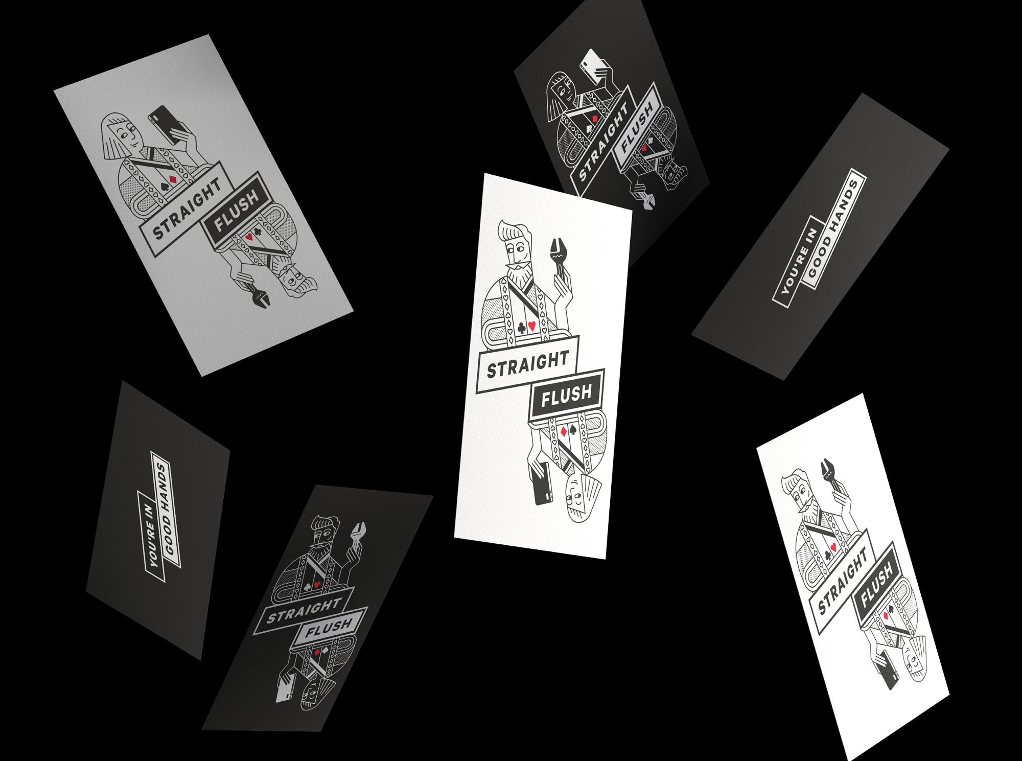
Successful Wellington-based plumbing business Straight Flush wanted to update their visual identity and build a brand that would enable them to expand, whilst retaining their name and the card symbols they were known for.
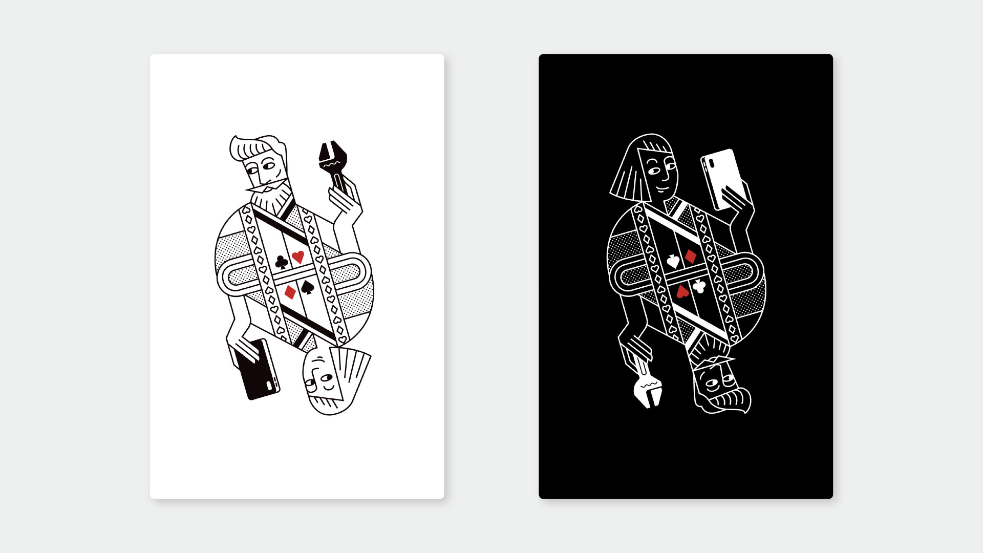
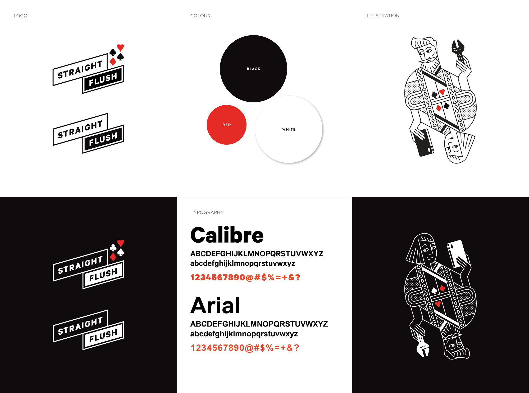
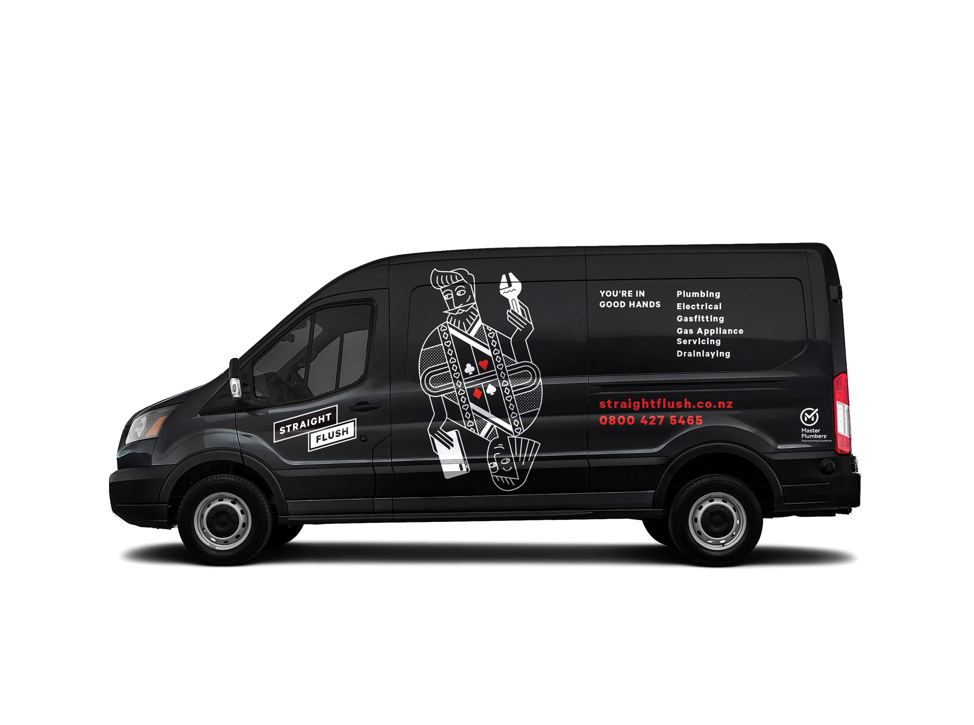
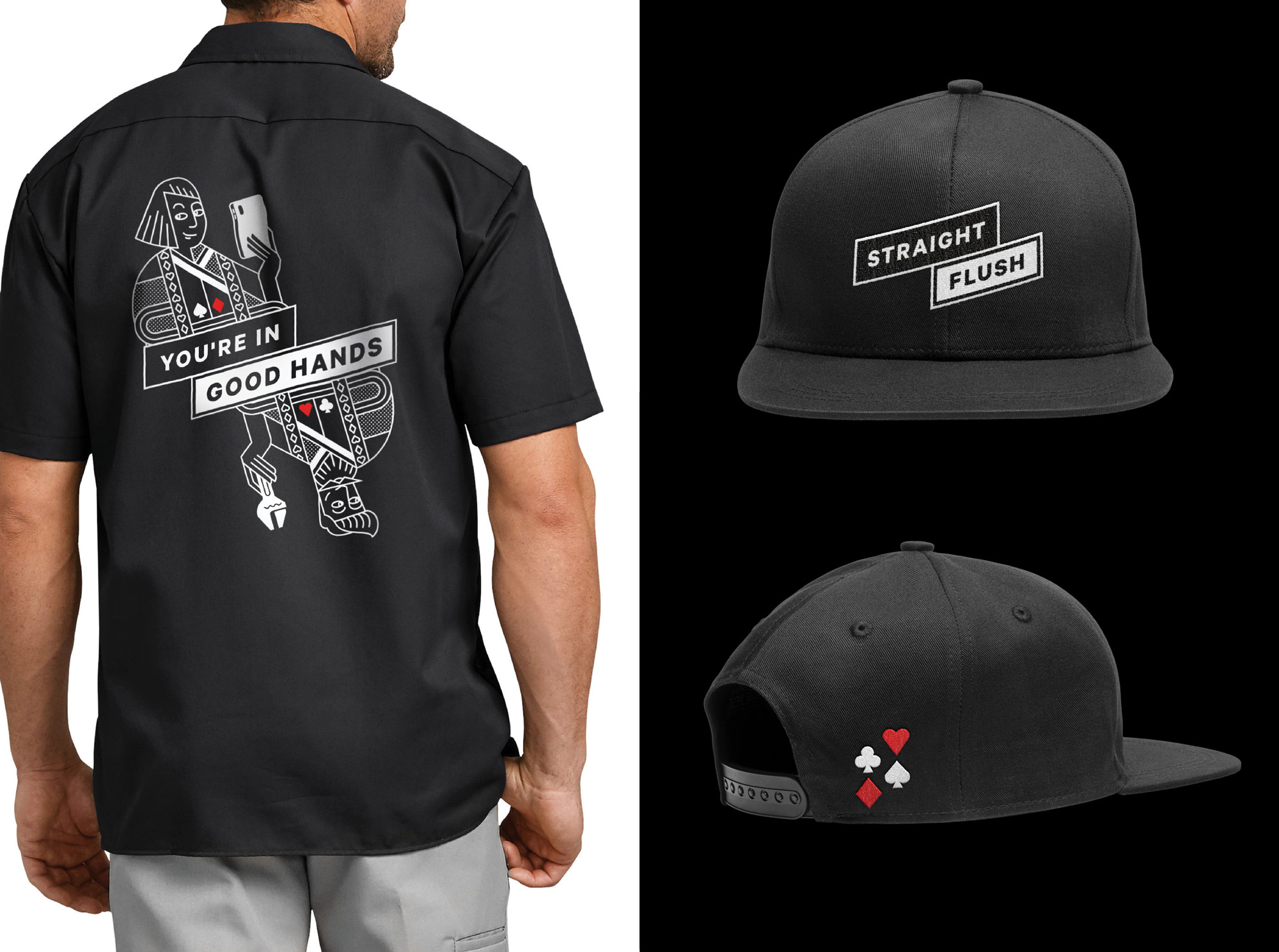
They opted for an adventurous approach that used the convention of playing cards to introduce characters, adding real personality to the brand and expressing the company’s dual strengths of excellent customer service and trade skills. We deliberately restricted the colour palette to black, white and a dash of red to link the new identity to the brand name and its connection with cards, and because we literally wanted the brand to stand out from the myriad of look-alike trade vehicles.
IMPACTS
Through this rebrand, Straight Flush were looking to:
- Refresh the brand so that it would stand out in the category and position the company for expansion
- Grow the brand beyond the owners in order to lift its franchising potential
- Make their own people proud of being part of the Straight Flush team
- Help the company achieve its vision of being New Zealand’s most successful residential trades company.
SCOPE OF WORK
- Brand strategy (lite)
- Visual identity design
- Vehicle livery
- Collateral design and production
- Uniforms